More leads through website relaunch
In a nutshell
The customer service assistant Flixcheck turned to us with the task of optimizing the web design for the purpose of targeting and, above all, lead-optimizing.
About Flixcheck
Flixcheck facilitates dialog and data exchange between companies and their customers and can therefore be seen as a kind of digital customer service touchpoint. For example, documents and contracts can be uploaded and signed easily via smartphone – and even legally secure. The special all-in-one solution for smart data exchange thus enables contemporary interaction between companies and their respective customers. Customer feedback can also be obtained regularly in this way: This ensures more transparency and ultimately more customer satisfaction.

New design language and optimized user experience
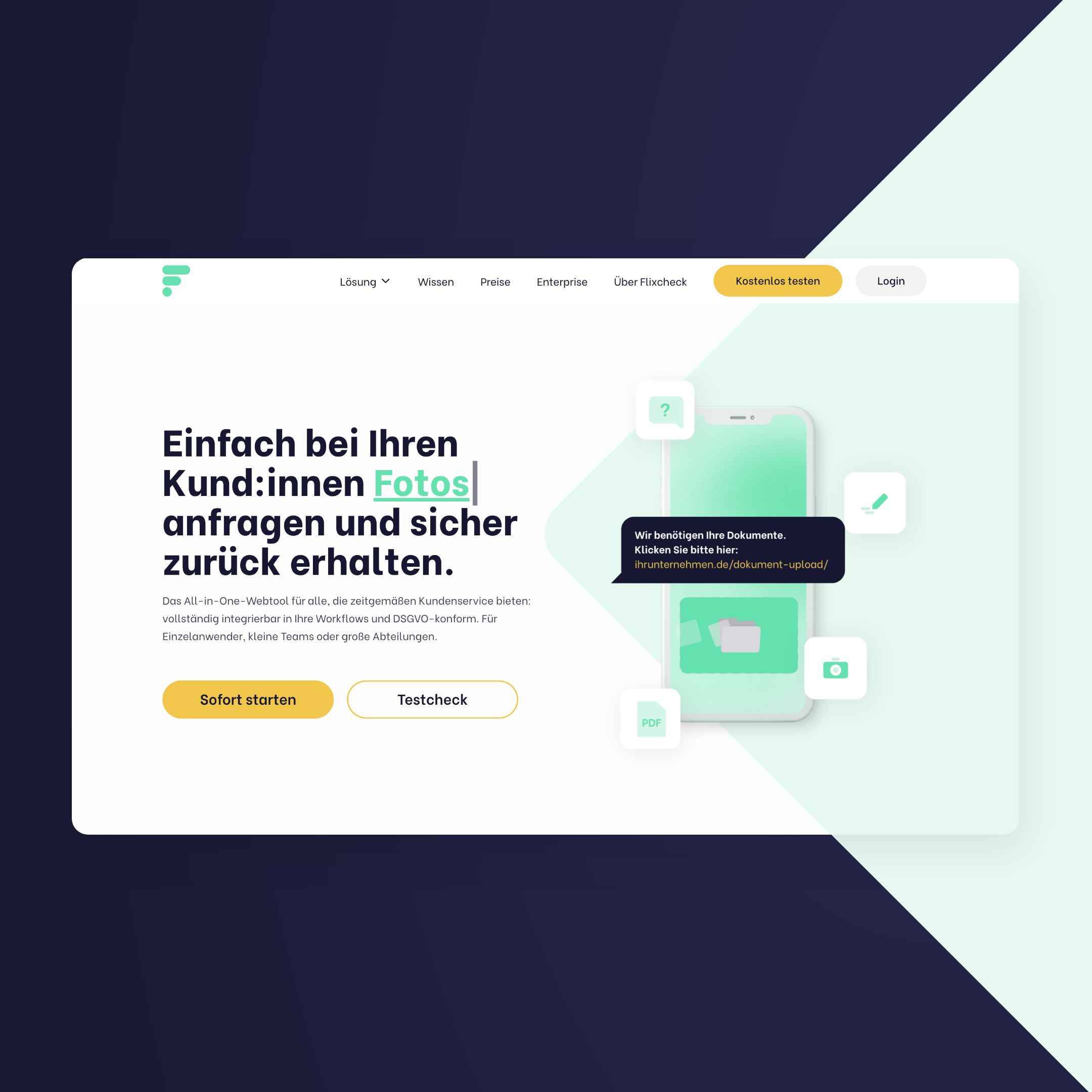
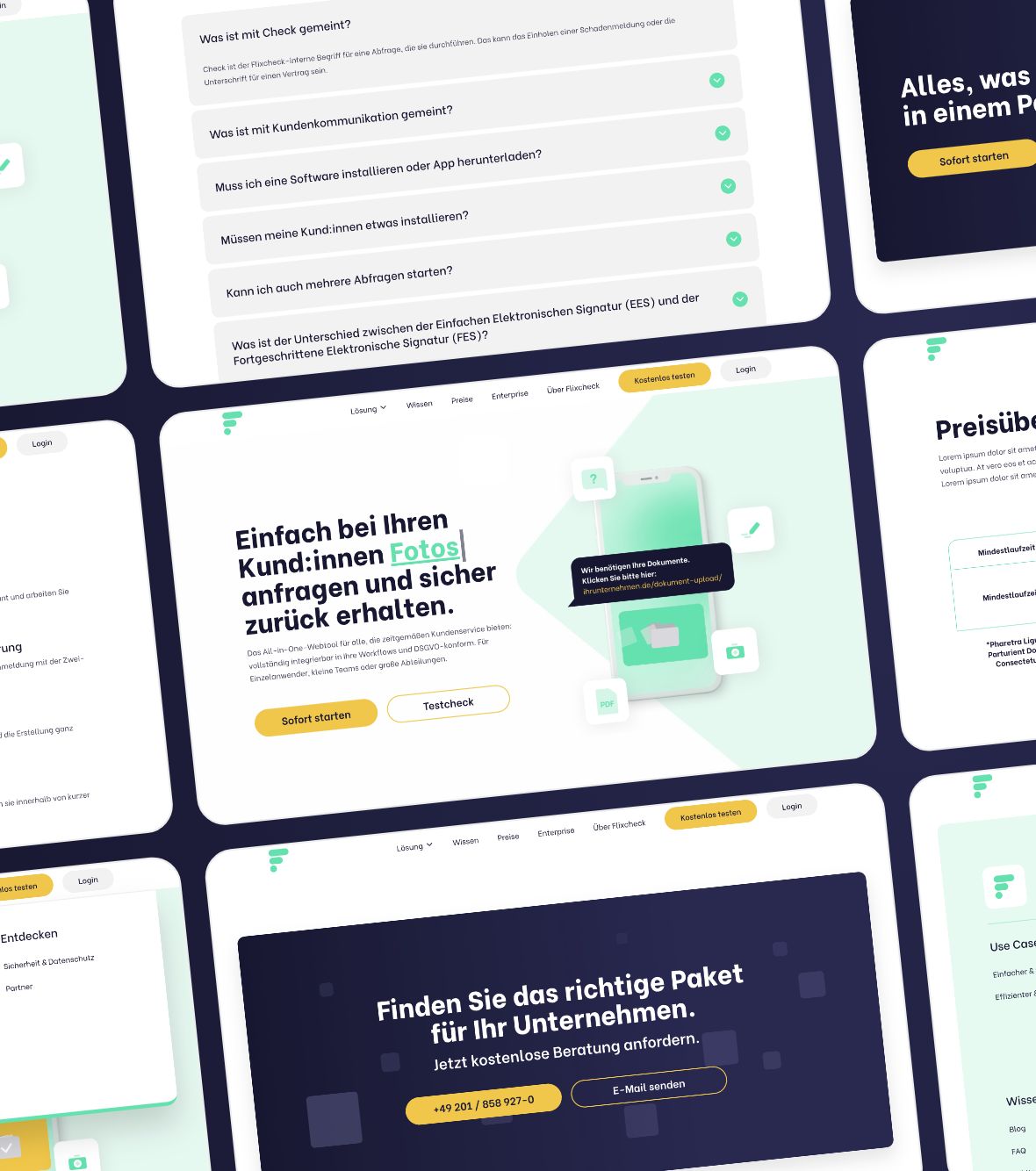
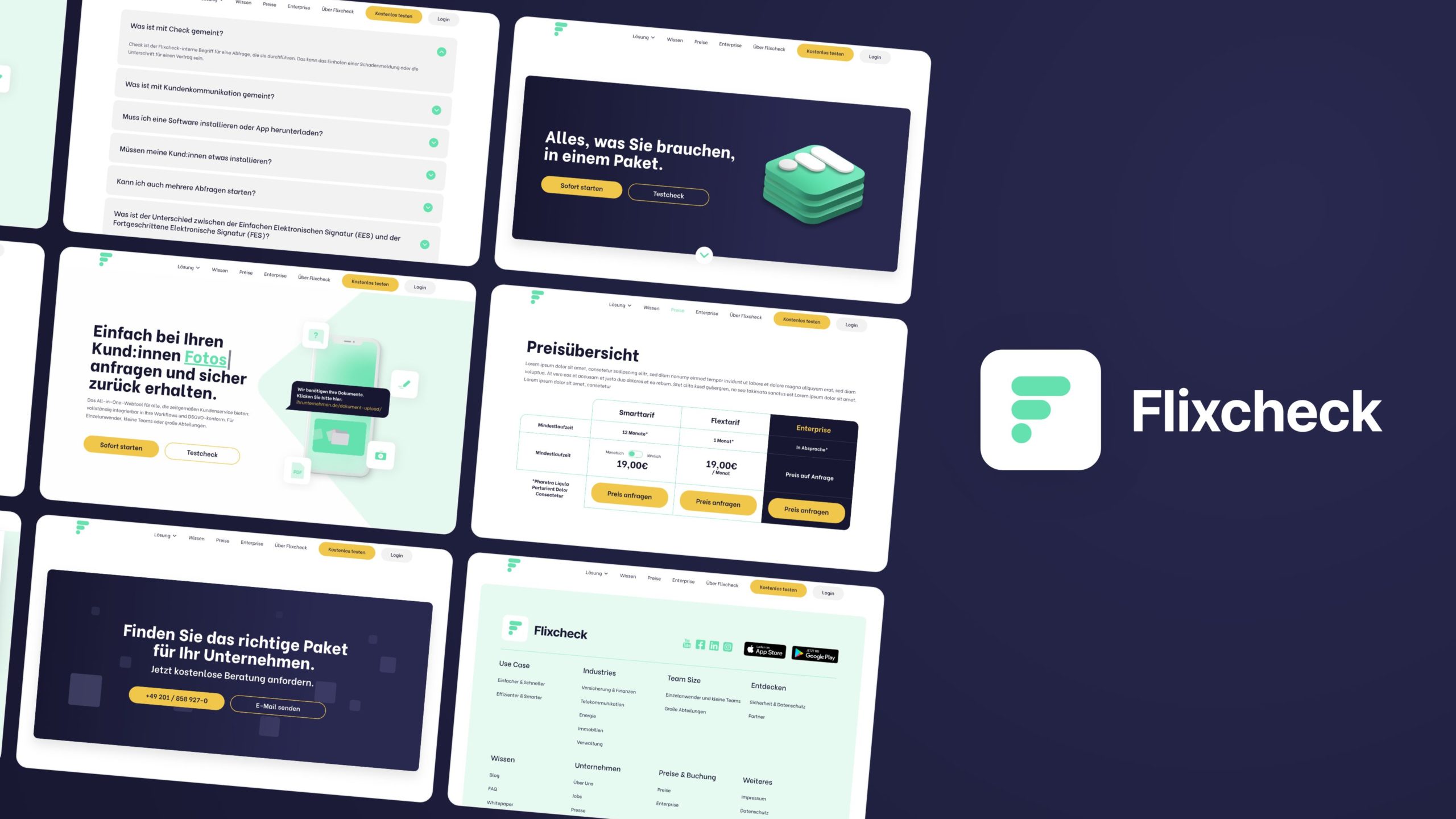
We wanted to reflect this innovative and absolutely smart approach visually and in the user experience. We eradicated the previously rather angular shapes, the rather meaningless stock photos and the conservative look, including generic-looking subpages, and opted for a design language that appears much more modern, harmonious and coherent thanks to round shapes and a new color scheme. We have also designed a mega-menu that structures the amount of sub-pages in a meaningful way, so that potential customers get an ideal overview of all services and know exactly how Flixcheck can help them.
“The collaboration with S+M was cleanly structured and always flexible enough to respond to our needs. The result is a conceptually and visually powerful website that meets the information needs of our target groups and ideally showcases Flixcheck.”
Mathias Staar - Founder & CEO
Our interdisciplinary design team then got together and brought together the expertise of Nik in UI design, Thi in user experience, our friends the Meta Maniacs in copywriting, Dennis for programming. It's a good thing that Lucas, as project manager, always kept track of the various construction sites.

We started with a target group analysis to create suitable personas, which in turn serve as a basis for outlining a customer journey. In other words, the process that a potential user goes through, from being noticed, to being directed to the website, to converting to a lead in the form of a free trial of the application or a subscription.
The "pain points" within this process that opened up for us were able to be addressed quite specifically in our outline of the ideal user flow (i.e., the user's walk through the website).
Together with our colleagues, the Meta Maniacs, we then created a sitemap and an information structure as well as functionalities through wireframes.
Meanwhile, the appearance was also adjusted by our designer Nik and in the end it all adds up to a result that we are really proud of.
Don't you want to see for yourself? Here you can get an idea of our work for Flixcheck: https://www.flixcheck.de/effizienter-smarter/.
Have fun!
Ready to grow with us?
Do you have questions about our services, our projects or need a quote?
We will get back to you today and provide you with a freefree and non-binding offer within 48 hours and clarify all your questions.
Work
