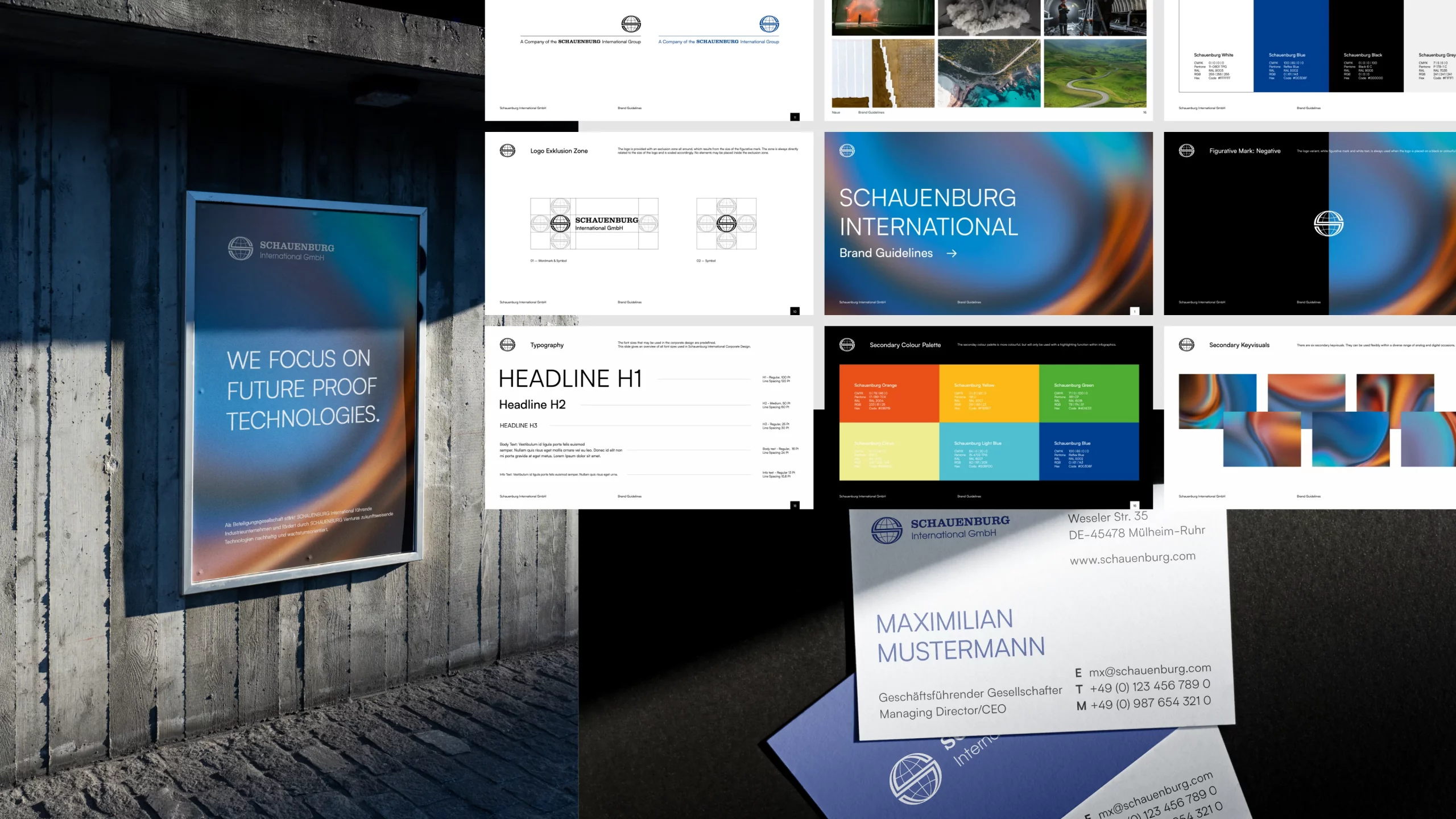
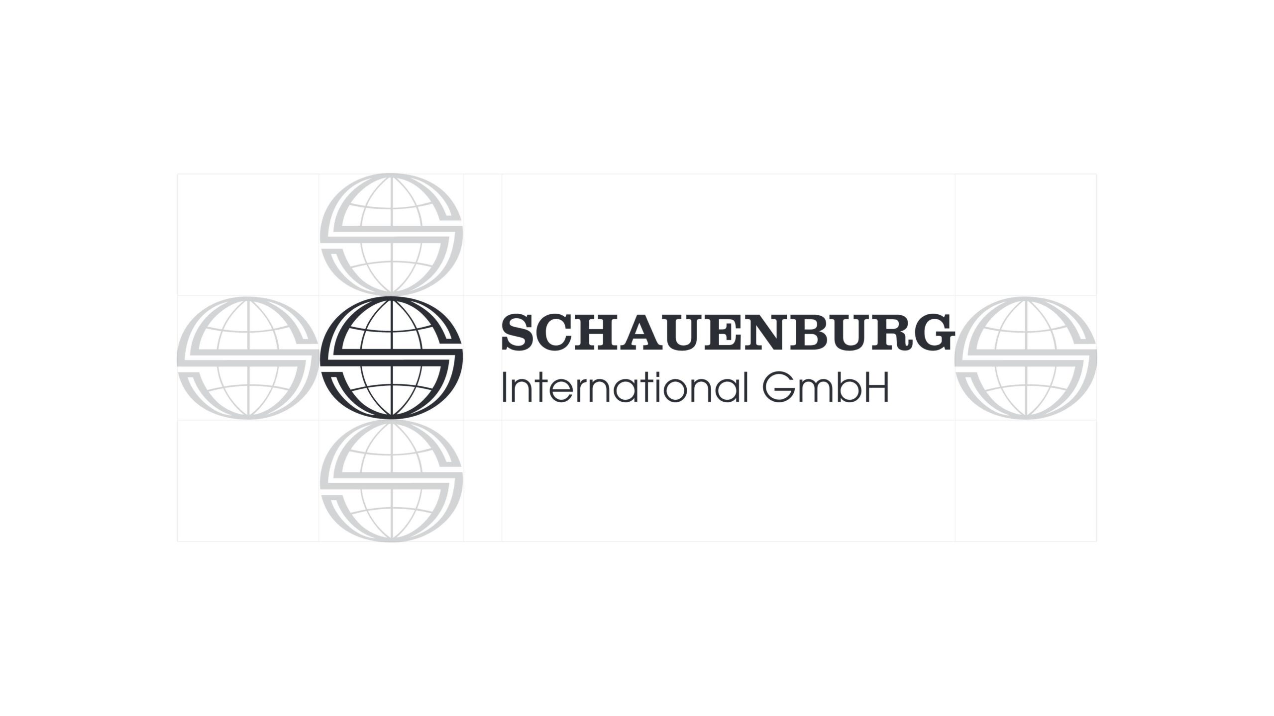
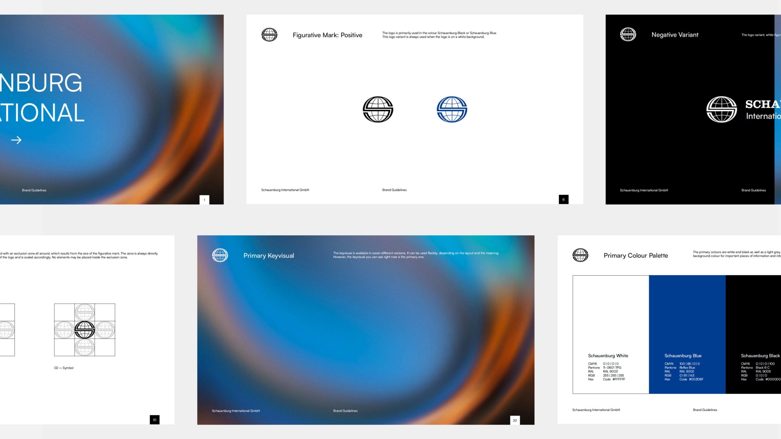
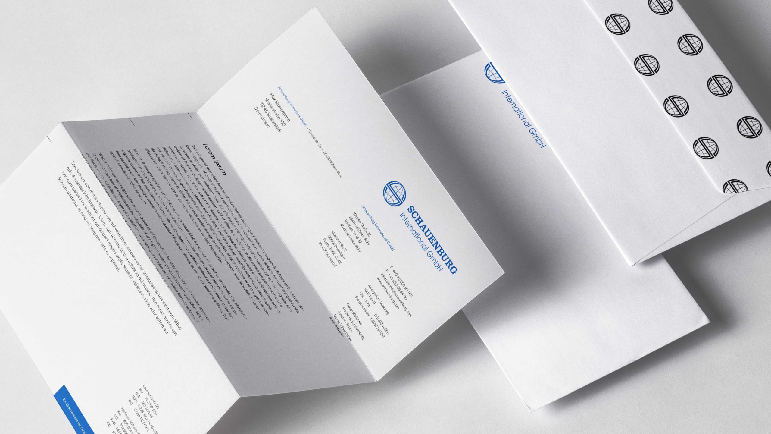
The company, which is managed by the second generation, faced the challenge of transforming itself from a former mining supplier to an internationally active family equity company. In doing so, we left the existing word/figurative mark virtually unchanged and created a modern design system around it.
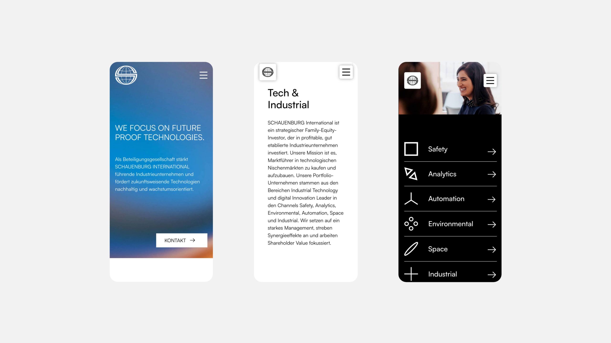
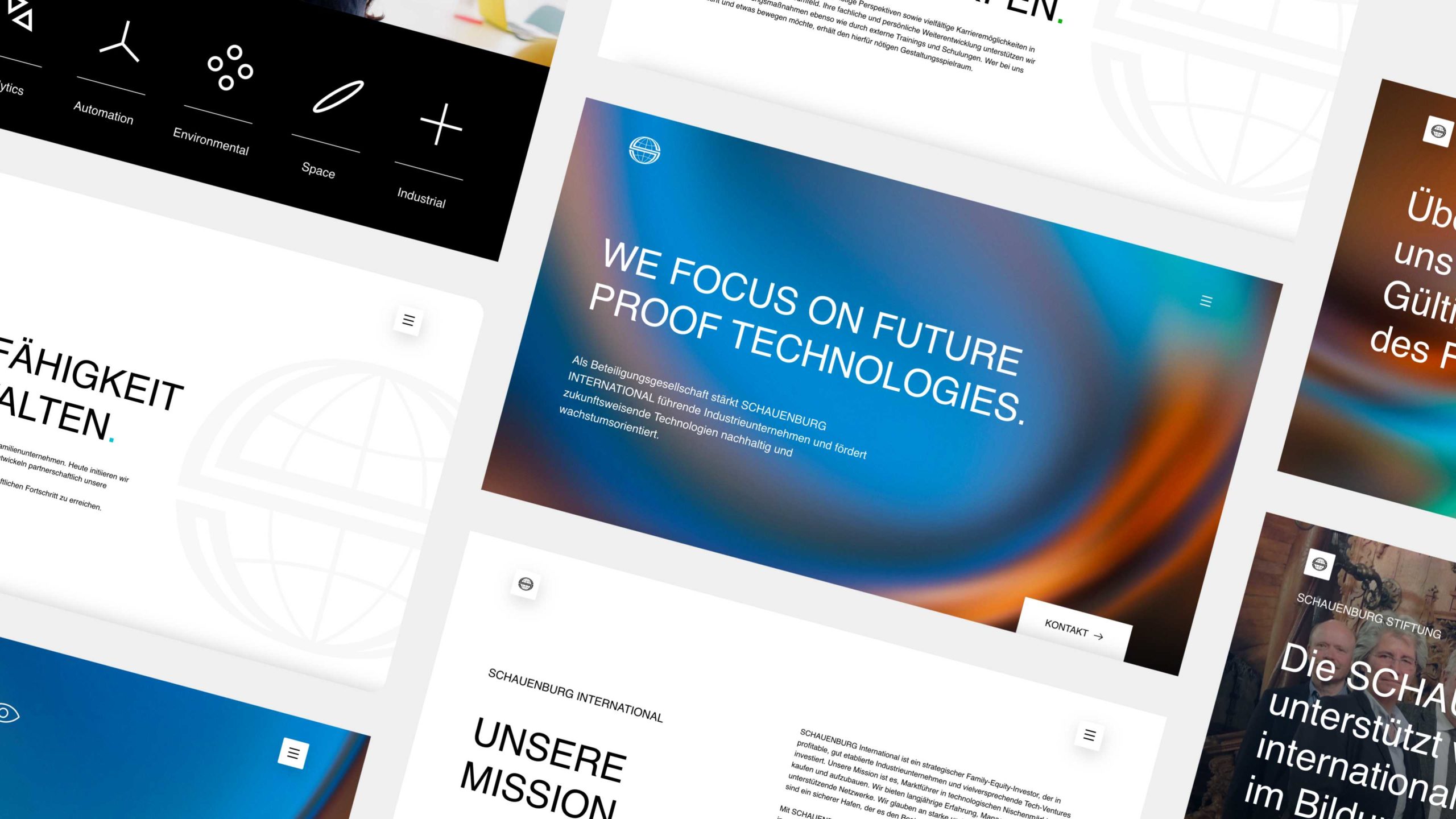
The new brand essence, the new key visual, the choice of typography and the modern interpretation of the logo also form the basis for the relaunch of the website.